Netflix Friend Friend

Overview
A closer look at a library app, one problem at a time.
An academic UX project auditing the EPL iOS app, identifying key usability issues, and taking one high-priority issue through a full redesign process — from research to final mockups.
Contribution | Category | Team | Timeline |
UX research Story board Design sprint Wireframing Prototyping | Web version | 4 designers (me) | 1 month |
Scope
Broad audit, focused fix.
Audited the app broadly to surface multiple usability issues, then narrowed focus to one: event discovery and registration. The project covered the full design cycle for this single issue. Backend work and a full app redesign were out of scope.
Problem & Stakes
When finding an event feels harder than attending one.
Finding events — both current and upcoming — was a confusing and time-consuming process. The app offered limited or no filters (by date, category, age group, or location), forcing users to scroll through long, unsorted lists just to find something relevant. Compounding this, the events section itself felt buried and low-priority within the app's overall structure, despite events being a major value offering of the library. This was the most frequently mentioned frustration and directly affected event registration and engagement.
Core sections of the app (catalog, events, account) were not clearly organized, making it hard for users to intuitively move between features without backtracking or getting lost. This was further compounded by unclear and low-relevance notifications (due dates, holds, new events), which often caused users to miss important updates or ignore alerts altogether.
Strategy & Decision
From sketches to solutions, one critique at a time.
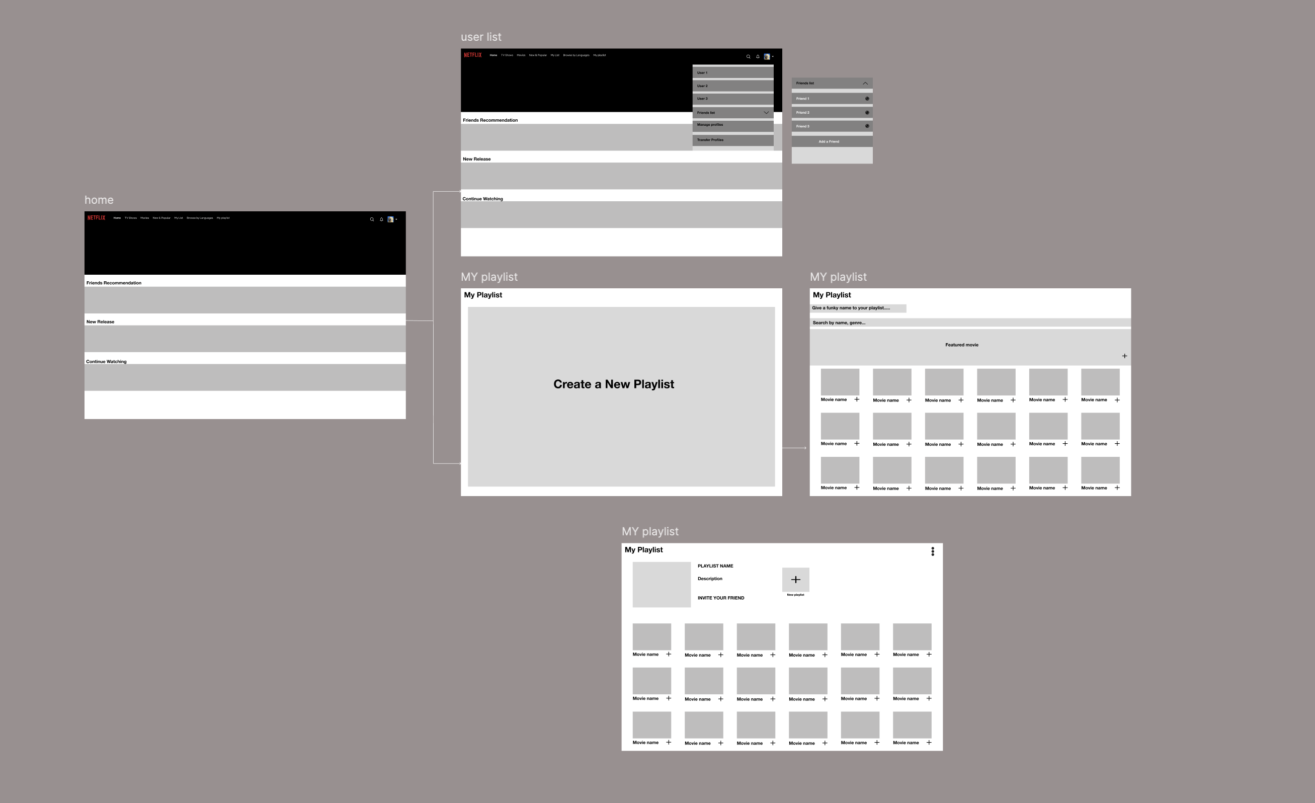
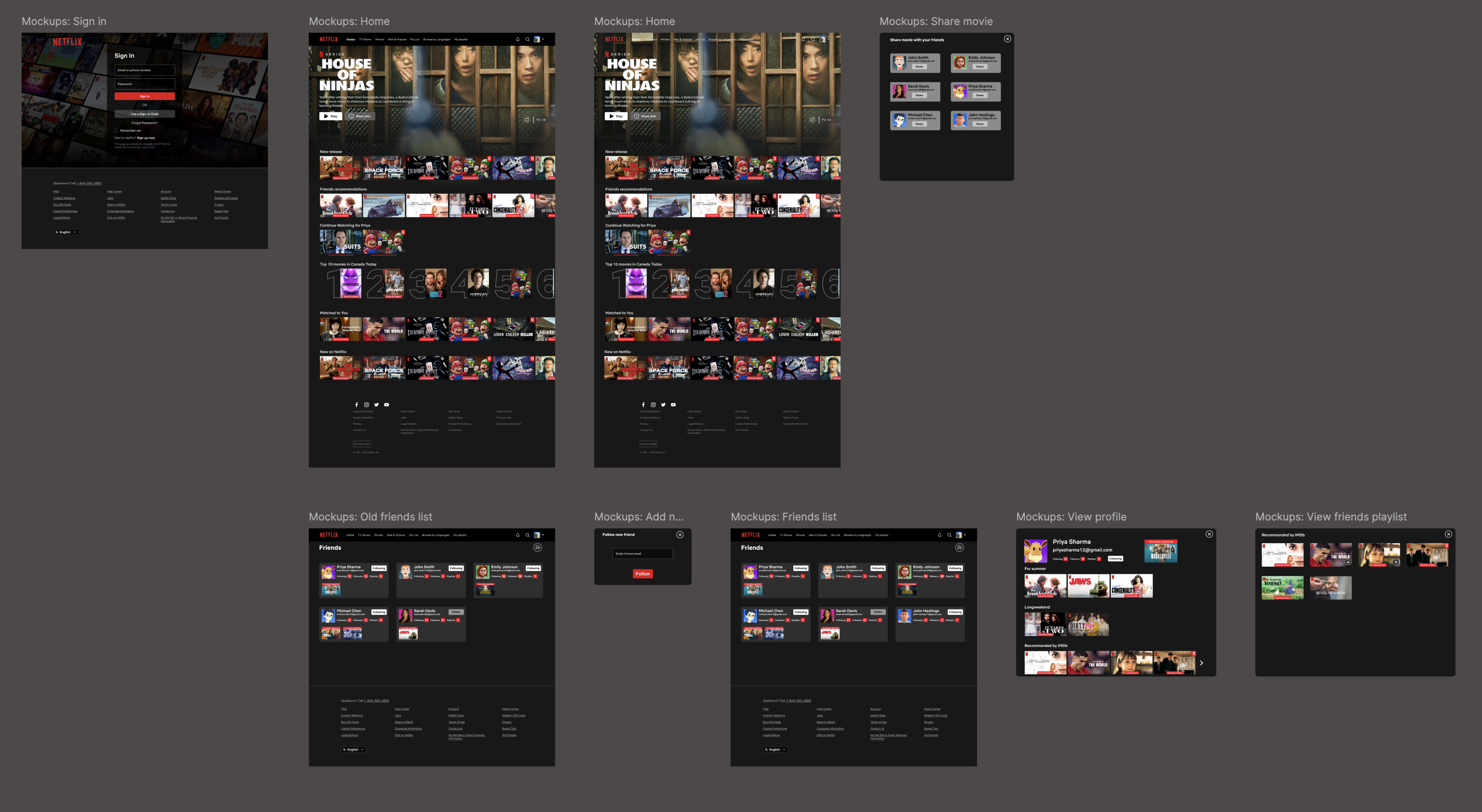
The process began with real user feedback on event-finding frustrations, combined with input from peer designers and my own ideas. This led to early sketches, refined through designer meetings into a finalized direction, then developed into low- to high-fidelity wireframes focused on filters, event cards, and a simpler registration flow. Critique sessions with senior designers and professors guided several rounds of iteration, resulting in polished final mockups delivered on time.
Wireframe
Low/Mid
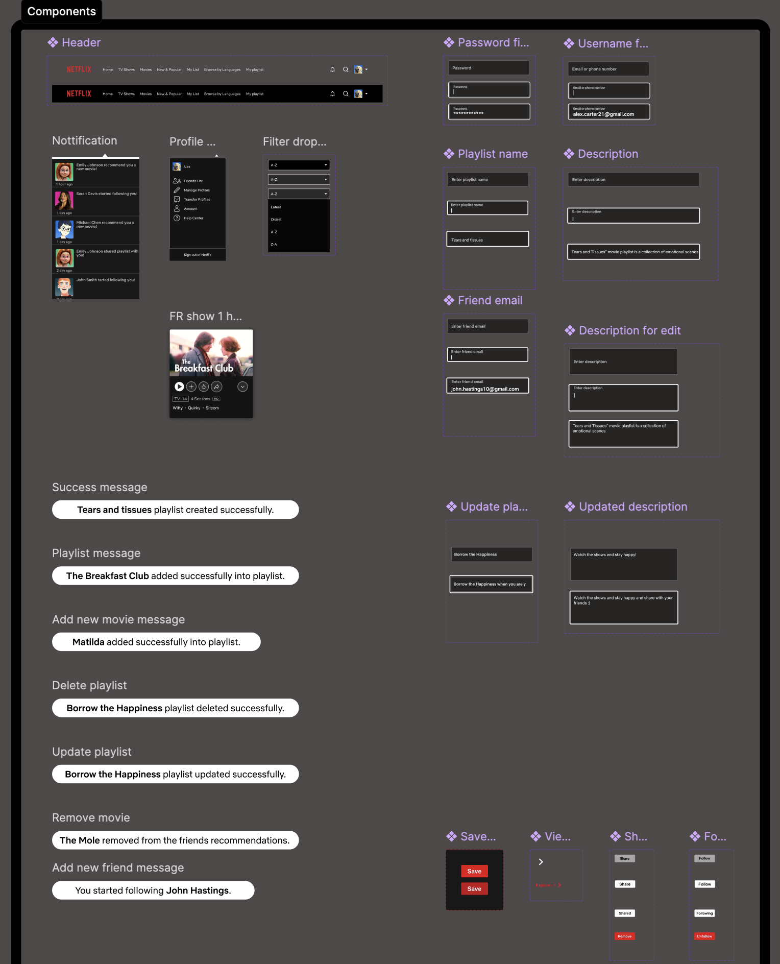
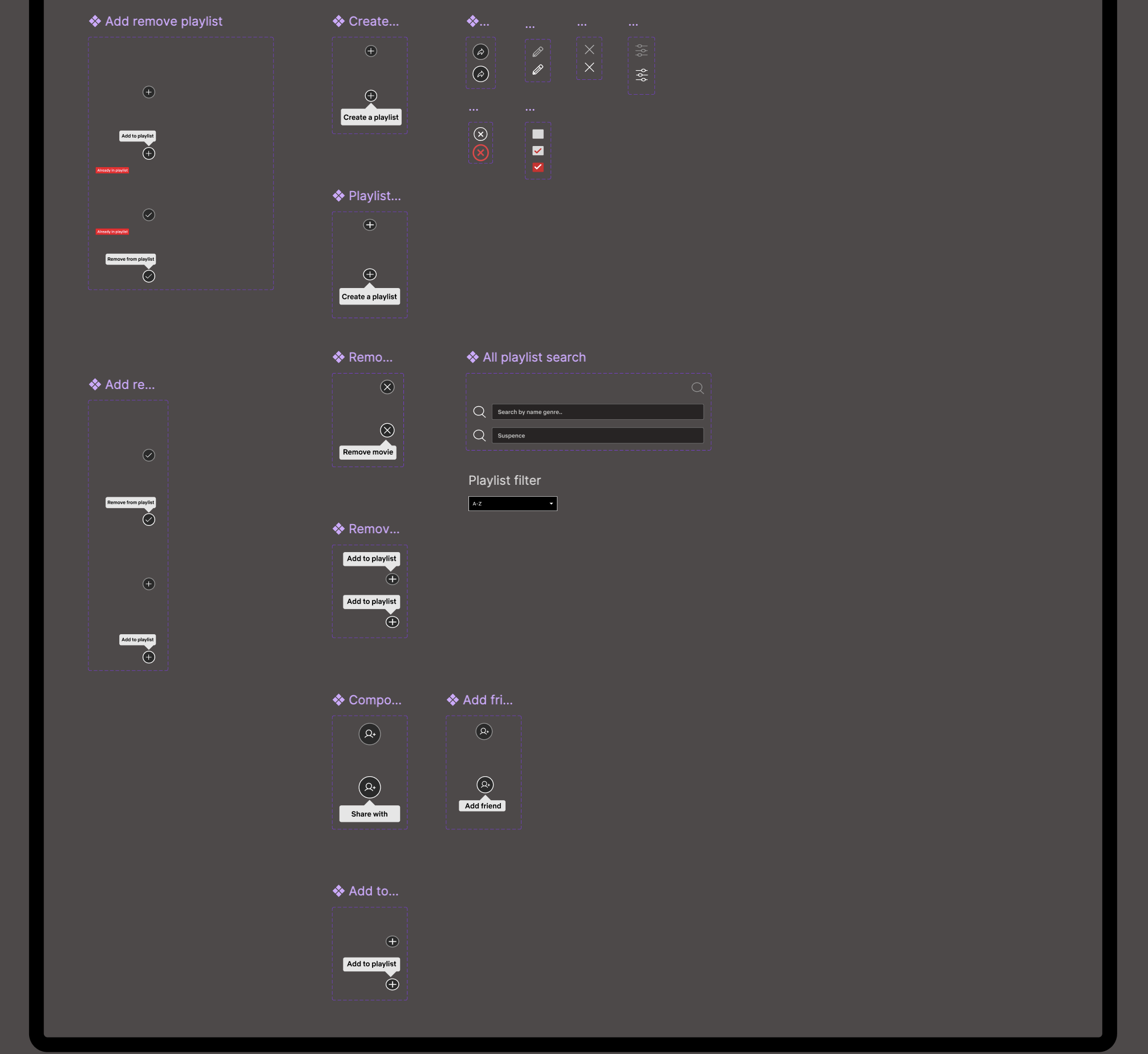
Components
Final Design
High
Low/Mid
Reflection
Every iteration taught something the first draft couldn't.
The project reinforced the value of narrowing a broad problem space to one solvable, high-impact issue and improving it through iteration rather than a single pass. Peer collaboration and critiques from senior designers/professors pushed sharper, more justified decisions. Next steps would include usability testing the final mockups with real EPL users and addressing the remaining issues identified during the audit.