RASC Edmonton

Overview
Bringing a community observatory's website down to earth
I designed and built a new website for the RASC Edmonton Observatory. My goal was to create a site that felt easier to use and better reflected the community it serves, starting with research and planning, and ending with a fully working website I coded from the ground up.
Contribution | Category | Team | Timeline |
UX research Wireframing Prototyping Web Developer | Website | Solo | 60 days |
Scope
Four pages, two phases, one complete site
Identified the four most-used pages on the RASC Edmonton website as the focus of the project. Phase one covered research, sitemap analysis, and full design for four pages. Phase two covered development of the redesigned site from scratch to final, coded using HTML and CSS while following coding standards and WCAG accessibility guidelines.
Problem & Stakes
An outdated structure standing between visitors and the stars
The site's navigation and sitemap weren't built around how users actually searched for information, making key content like event schedules, membership details, and observatory access harder to find than it should be.
The site had to follow WCAG accessibility guidelines and defined coding standards, which shaped decisions around colour contrast, semantic HTML, and navigation structure from the start rather than as a later fix.
Strategy & Decision
From sitemaps to shipped site, step by step
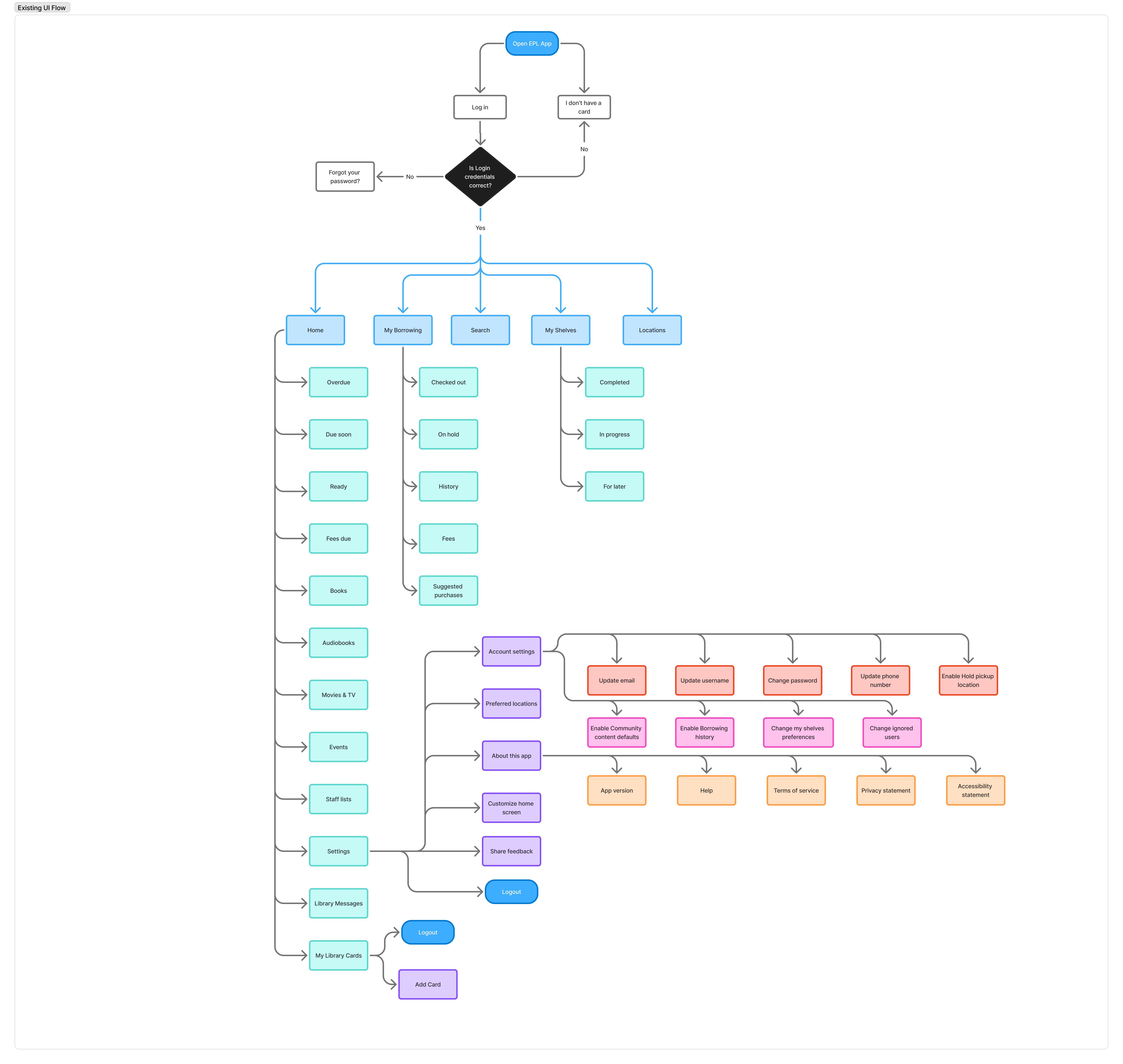
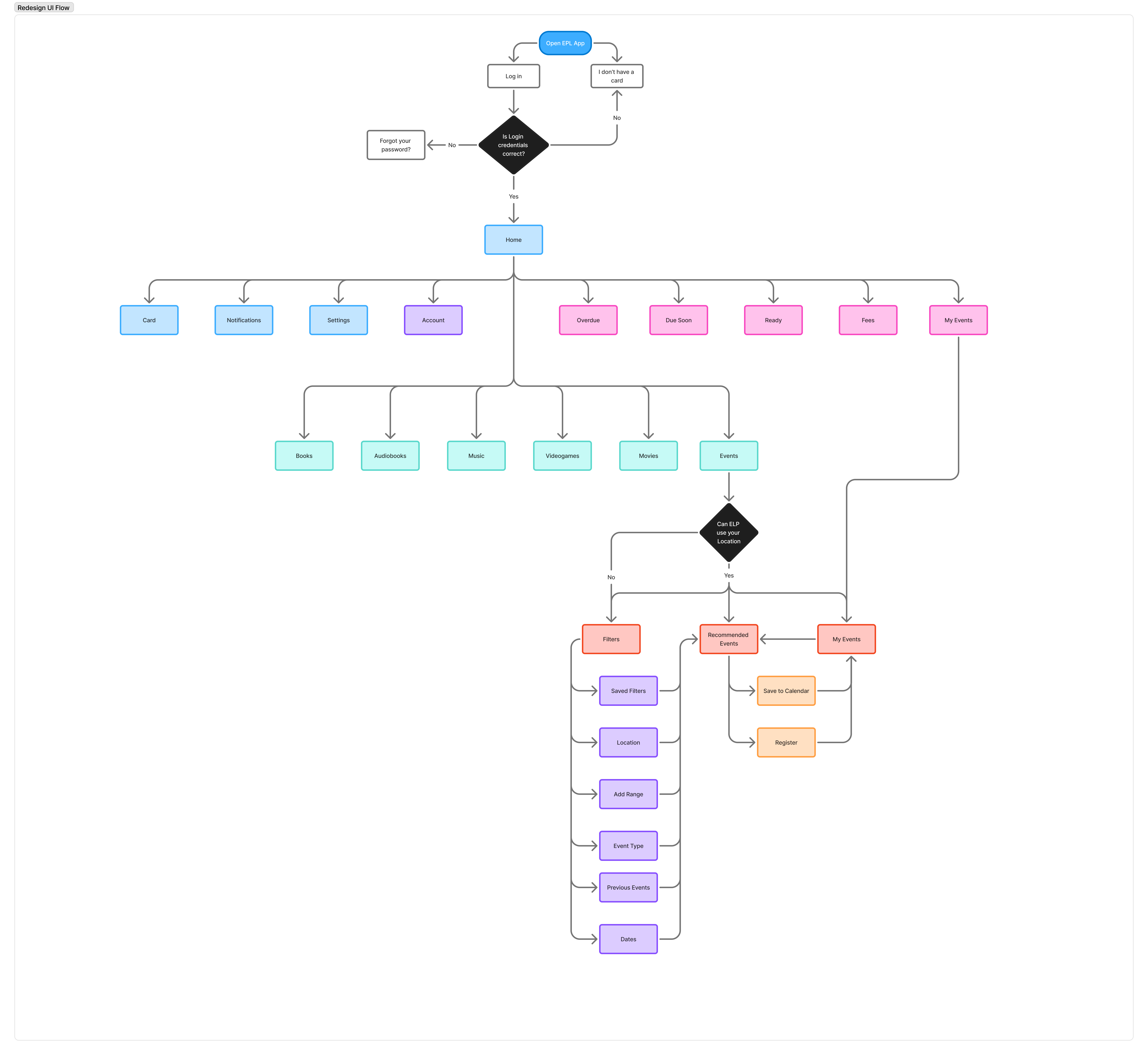
The project began with research and user interviews to understand how visitors actually used the site, followed by mapping the old sitemap for the four key pages. Each page was designed through sketches and wireframes, refined through critique sessions with other designers, and iterated on based on feedback. In the second phase, the finalized designs were developed into a fully coded website using HTML and CSS, following coding standards and WCAG accessibility guidelines to ensure the site was both efficient and inclusive.
Task Flow
Old
New
Low-Fi
Final Design
Reflection
Every iteration taught something the first draft couldn't.
The project reinforced the value of narrowing a broad problem space to one solvable, high-impact issue and improving it through iteration rather than a single pass. Peer collaboration and critiques from senior designers/professors pushed sharper, more justified decisions. Next steps would include usability testing the final mockups with real EPL users and addressing the remaining issues identified during the audit.
other projects

Netflix Friend
Coral Reef Simulator